The Joy of Children’s Books

27 Feb

Recently, my two-year old niece, Anna, has been transfixed by one certain book, Who is the Beast? by Keith Baker. Almost everyday, she runs up to my sister with the book in hand demanding, “beast, beast.” Once she sits down, she immediately starts pointing out all the hidden, snail illustrations on each page. Although I wonder how much of the story she actually comprehends, it is funny seeing Anna so mesmerized by one book.

Who is the Beast by Keith Baker

**Who is the Beast? written and illustrated by Keith Baker. Synopsis: A friendly tiger is confused by jungle animals fleeing from a beast, until he discovers he is the beast…he returns to them and points out their similarities. (Image and synopsis courtesy of barnesandnoble.com)**

Before Anna, I didn’t give much thought to children’s books. However, she has opened my eyes to a real exciting art form.

Generally speaking, children’s books are quite short. Yet those words hold the potential for a much broader story and meaning. For me personally, how well the illustration conveys the meaning is the most important thing. No matter how good the story is, if the illustration falls short, it most likely will not be counted among my favorites.

So what do I consider good illustration? I love compositions that add another level that aren’t necessarily obvious in the words. I especially love when this is done through the additional of a small detail. More often than not, I find that these details make the story more rounded and possibly more relevant to the adults who have to read them over and over. On top of that — and you might think that this goes without saying — I love illustrations that are good compositions. I enjoy dynamic lines, bold textures, and interesting use of white space. Of course, these don’t necessarily have to be present to constitute a good composition. These are just the elements that draw me toward a particular book.

Since rediscovering my love for illustrations, I have been rereading some of my favorite books and studying them. I have also found a book, quite by accident, at the library celebrating the greatest children’s book illustrators during the 20th century. Edited by Julie Cummins, this book is titled Children’s Book Illustration and Design. I would suggest anyone interested to check it out.

* * *

Now, I will present some of my personal favorites or books I think I would like based off the illustration. If I haven’t read them, they were taken from the book mentioned above. (The ** indicates I have read the book personally)

Animalia, written and illustrated by Graeme Base. Synopsis: An alphabet book with fantastic and detailed pictures. Other works from Graeme Base include The Eleventh Hour. (Image and synopsis courtesy of barnesandnoble.com)

The concept behind Animalia is as simple as they come; it is an alphabet book. Yet the author and illustrator, Grame Base, includes so much detail, that I bet the reader finds something new at each reading. Further, I like that the whole book is alliterative. The spread shown above reads, “Lazy lions lounging in the local library.”

The Mitten by Jan Brett


**The Mitten, written and illustrated by Jan Brett. Synopsis: When Nicki drops his white mitten in the snow, he goes on without realizing that it is missing. One by one, woodland animals find it and crawl in…until the bear sneezes. (Image and synopsis courtesy of barnesandnoble.com)**

I discovered The Mitten from my former roommate. She was an elementary education major, and as a result, often brought back children’s books to study. Naturally, I took breaks from my homework to peruse a few of them.

I immediately fell in love with this story (see above for synopsis). However, it was the addition of a side panel that sealed it as a favorite. After Nicki realizes he lost his mitten, he begins doing what anyone would; he starts searching for it. Within the side panel, the reader sees his story unfold, despite the fact that the main plot is centered around the woodland animals.
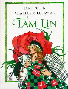
A young girl triumphs over the Queen of Faeries to reclaim her ancestral home and free her true love in this haunting retelling of an old Scottish ballad.

Tam Lin, written by Jane Yolen and illustrated by Charles Mikolaycak. Synopsis: A young girl triumphs over the Queen of Faeries to reclaim her ancestral home and free her true love in this haunting retelling of an old Scottish ballad. Other books illustrated by Charles Mikolaycak include his self-authored work, Babushka. (Image and synopsis courtesy of barnesandnoble.com)

This has a lot of elements that could make it a favorite in the future. For starters, the subject matter is based off a Scottish tale. Although I don’t know many Scottish stories, it is a part of my heritage. This fact alone makes it intriguing to me. However, Charles Mikolaycak’s dynamic style sealed it. He constantly employs the rule of thirds and breaks a self-made border. These paired together creates a sense of heightened drama. Along with this, he had to draw a lot of plaid. Knowing how fabric falls is hard enough without adding a pattern. Mikolaycak did it in a way that is believable.

(Image from http://www.patriciapolacco.com/, synopsis from )

Rechenka’s Eggs, written and illustrated by Patricia Polacco. Synopsis: Babushka, known for her exquisite hand-painted eggs, finds Rechenka, a wounded goose, and takes her home. When she’s ready to try her wings again, Rechenka accidentally breaks all of Babushka’s lovingly crafted eggs. But the next morning Babushka awakens to a miraculous surprise. (Image courtesy of patriciapolacco.com and synopsis from barnesandnoble.com)

The contrast and patterns drew me to Rechenka’s Eggs. Patricia Polacco’s choice of making the whole composition seem relatively flat, yet add depth in the face and hands is quite interesting. She could have stopped there; but by striping Babushka of the bold, colorful patterns of everything else; she made the contrast more apparent. I look forward to seeing how Polacco’s style plays out in the rest of the book, instead of just in the detail seen above.

**My Friend Rabbit, written and illustrated by Eric Rohmann. Synopsis: When Mouse lets his best friend, Rabbit, play with his brand-new airplane, trouble isn’t far behind. (Image and synopsis courtesy of barnesandnoble.com)**

To put it simply, My Friend Rabbit amuses me. While the story is straightforward, Eric Rohmann never explains step by step what is happening. His writing tells you just enough, but the illustrations do all the talking. What a refreshing change of pace!

Screen shot 2013-02-25 at 5.55.08 PM

Tom Thumb, retold and illustrated by Richard Jesse Watson. Synopsis: With courage, wit, and the help of animal friends, Tom shows that despite his size, he is a hero. (Image and synposis courtesy of barnesandnoble.com)

While it is not apparent on the cover of Tom Thumb, Richard Jesse Watson uses quite a bit of forced perspective in the spreads of this book. Additionally, he breaks his own border, furthering suggesting extreme sizes. I’ll have to compare it to other illustrated editions of Tom Thumb, before I can give you a final verdict.

Screen shot 2013-02-25 at 5.55.27 PM

The Napping House, written by Audrey Wood and illustrated by Don Wood. Synposis: Delightful cumulative rhyme leads up to the consequences of piling too many sleepy people and animals in a cozy bed. Other books from this pair include Heckedy Peg and King Bidgood’s in the Bathtub. (Image and synopsis courtesy of barnesandnoble.com)

From what I have learned about this story, the changes from spread to spread aren’t very dramatic. It pretty much all occurs in the same room, giving Don Wood the challenge of holding a readers interest from spread to spread. It is interesting seeing the lighting and point-of-view change slowly over the course of the story.

* * *

Since many children’s books exist, I know that I have probably overlooked tons of good illustrators. For instance, when I was a kid, I enjoyed any book from the Serendipity series. As far as I know, these were solely written and illustrated by Stephen Cosgrove and Robin James respectively. However, if I included everything the list would continue forever. So for now, I’ll leave the list as is.

A Student’s View on Collaboration

13 Feb

In school, design students are used to working solo. They research their projects by themselves, create concepts by themselves, and execute their designs by themselves. While there are class discussions and critiques about other student’s designs, these are limited and normally after the projects are complete. By the end of school, design students have rarely been part of a true team environment.

However, in the workplace, collaboration is the norm. Everyday, designers work alongside web developers, marketing professionals, content writers, and project managers. These individuals develop concepts together and continually give input throughout the entire process.

While working at The Catapult Project as a Graphic Design Intern, I was amazed at how a collaborative atmosphere changes everything. With everyone working toward a common goal, people are invested in the quality of the final product. They actively search for new ideas, and the original concept quickly evolves. Additionally, when an idea is discussed, a contagious, creative energy is produced.

Personally, I love collaborative environments. It helps being surrounded with people from different backgrounds and viewpoints. Most likely, other people will see what is missing or point out something I never considered before. Additionally, the best people for the job can be assigned particular roles, feeding off of everyone’s strengths. It seems like a win-win to me.

However, I know that I am probably idealizing collaboration a bit. Much like everything else in the world, there are downsides to it. Bad conflict or groupthink can significantly hurt a team. Furthermore, decisions could take longer, because one needs to confer with the rest of the group.

Still, so long as everyone is aware of the possible downfalls, I do not see why collaboration should not be applied more. No one is perfect and a team helps fill in the gaps. The only thing left for me to wonder is why don’t schools stress it more?

Keep Calm and Trend On

30 Jan

I can’t remember exactly when the “Keep Calm and Carry On” parody posters started surfacing, but I have to say that I am impressed that they still are around. While they are not as popular as they used to be, I still find them kind of entertaining.

For those who don’t know, these are based off of some unissued, WWII, propaganda posters on the event that the Germans invaded Britain. At least, that is what this website tells me.

I think the reason they are so popular is:

  1. They are easy to duplicate.
  2. They can be applied to any topic.
  3. It is fun to say.
  4. The original design was just that awesome.

Personally, I like the posters that keep as much as the original design/ wording as possible. Below I include three of my favorites from a Google search.

Photo courtesy of zazzle.com.

Photo courtesy of zazzle.com. What’s better than combining two trends into one design?

Photo courtesy of depositphotos.com. I would have liked this design even better if it read, "Keep calm and put your glasses on."

Photo courtesy of depositphotos.com. I would have liked this design even better if it read, “Keep calm and put your glasses on.”


Photo courtesy of dumpaday.com.

Photo courtesy of dumpaday.com. This one makes more sense if you have seen Star Wars.

Get Motivated!

16 Jan

“The way to get started is to quit talking and begin doing.”
– Walt Disney

If you ever have trouble beginning a project, just remember this quote. For some reason, it actually works. If I had to guess, I think the fact that it isn’t coming from yourself helps. We all have those days when getting down to work is hard. Finding the motivation to start is usually all you need to create momentum.

Change Your New Year’s Resolutions

2 Jan

New Year’s resolutions are a testimony that people want to make a change in their life. While they have the potential to be a catalyst, it is more likely that they will simply reappear on a person’s list the following year. What is it about resolutions that make the follow through difficult?

While I have my share of repeat offenders, I am determined to make progress this year. For those pessimists who may ask what makes this year different, I’ll tell you — I have developed a new perspective.

Simply put, change is not as complicated as some people led us to believe. I am not saying that change is easy, in fact, it might be one of the most difficult things. I know it sounds like I just contradicted myself, so let me explain.

I’ll start with how change is difficult. Change is difficult because someone has to be full committed. He has to put in a conscious effort everyday without necessarily seeing the results. Because it is a gradual experience, people may give up and restart several times, causing extra frustration and possibly feelings of failure.

But change doesn’t have to be that way. If a person breaks up change into smaller chunks, it becomes easier to cope. Instead of seeing everything you have to do, focus on step one. After that, proceed to step two and three and so forth.

As you progress, do not be discouraged if you slip up. It will happen. People are not perfect creatures. Accept your mistakes, but start fresh the next day. The key is to learn and move on.

As you begin your path to change, here are some other things to consider:

  1. You have to be committed to change. You will not get far if you don’t want it with every fiber of your being. If you don’t have such a strong reaction, maybe you should ask yourself why you want to change.
  2. Have a plan of attack. Your chances of success go up if you spell out exactly what you want and by when you wish to accomplish your goals. If you feeling stuck or at a loss for what to do next, check out this article from the Harvard Business Review. The most important thing you can do is keep moving forward.
  3. You must be accountable. Mark it on your calendar if you have to. One of the keys to a successful change is making it into a habit. Habits do not develop overnight so you must stay vigilant. Weekly checkups are good ways to avoid huge missteps.
  4. Be realistic. Setting impossible goals are a good way to lose self esteem. Remember to cut yourself some slack and know your limits. As much as possible, fit your goals around your lifestyle and existing habits. 
  5. Celebrate. Don’t be afraid to treat yourself to something small when you meet one of your steps. It won’t seem as tiresome if you take some time to enjoy how far you have come.

End of the World Designs

19 Dec

With all the talk about the end of the world, I thought I would have some fun doing a google search for end of the world designs. Below, I have compiled some of my favorites.

From Good Infographics:

Designed by Good Infographics


From Designrs Hub:
This article looked at 20 different cataclysmic advertising designs. Below, I include my top three.

Designed for Banco Financiero

Designed for Arena

Designed for Lexum European Eye Clinic

Color Theory and the Color Quiz

21 Nov

Sometimes when I am bored, I scour the web for personality tests to take. At this point, I am hard-pressed to find any new ones. In fact, it is even getting to the point where I know how to answer questions in order to get a certain result. This is why I love tests that don’t ask obvious questions or the meaning is hidden behind an additional level of information.

One such test is the color quiz. All you have to do is choose the colors that make you feel the best and it will generate your existing situation, your stress sources, and your problems. I have taken this test many times over the years, and I have to say that it has been surprisingly accurate each time.

After some time, I got curious about the color theory behind the test. Apparently, the color quiz was developed from work done by color psychologist, Dr. Max Luscher. Here is a brief description of his work, while this link takes you into a more detailed explanation of the color quiz. I would recommend anyone remotely interested in color theory to check these out after taking the quiz.

Spirit of Design vs. Inner Critic

7 Nov

Every designer has an inner critic. Some are better controlled than others, but everyone has one.

I can’t speak for others, but mine always seems to be contrary to the spirit of design. For me, design is all about the possibilities— the possibilities of a designer’s idea, the possibilities for improvement, and the possibilities of a program. If I can hold on to these, I can ignore or cope with my inner critic. However, sometimes my inner critic gets his comments in a little too early. I don’t like hearing that something can’t be done or shouldn’t be done, especially in the initial stages of a project.

Luckily, the extent in which the inner critic plays is up to the designer. While the inner critic can be useful, the majority of the time, he needs to be silenced. Simply knowing that a designer can control him helps. However, for the times that this knowledge is not enough, steps can be taken.

Towards the end of this article on A List Apart, the author, Denise Jacobs, talks about ways to control the inner critic. I recommend that everyone, creative or other, read this article. She explains it better than I ever could and goes into more depth about the inner critic. It is a bit lengthy so give yourself plenty of time to read it.

Good luck to all trying to control their inner critics.

Architectural Oldie But Goodie

17 Oct

Frank Lloyd Wright is one of my favorite architects. I have visited the Dana Thomas House in Springfield, Illinois and was amazed. I love the open floor plans and integration of nature and light. Unfortunately, I haven’t had the opportunity to visit Fallingwater in Mill Run, Pennsylvania (pictured below). I am sure that it is absolutely incredible. I would encourage everyone to see at least one of Frank Lloyd Wright’s designs or learn more about this amazing architect.

Photo courtesy of Wikipedia’s article on Frank Lloyd Wright.

Karmin Lyrics Tie Nicely Into Music Video

3 Oct

Like all other music videos, Karmin’s I Told You So music video has nothing to do with the song. Still, I love its concept and how the lyrics tie into the video.